UX research
Uncover user needs, pain points, and behaviour patterns to guide confident product decisions.

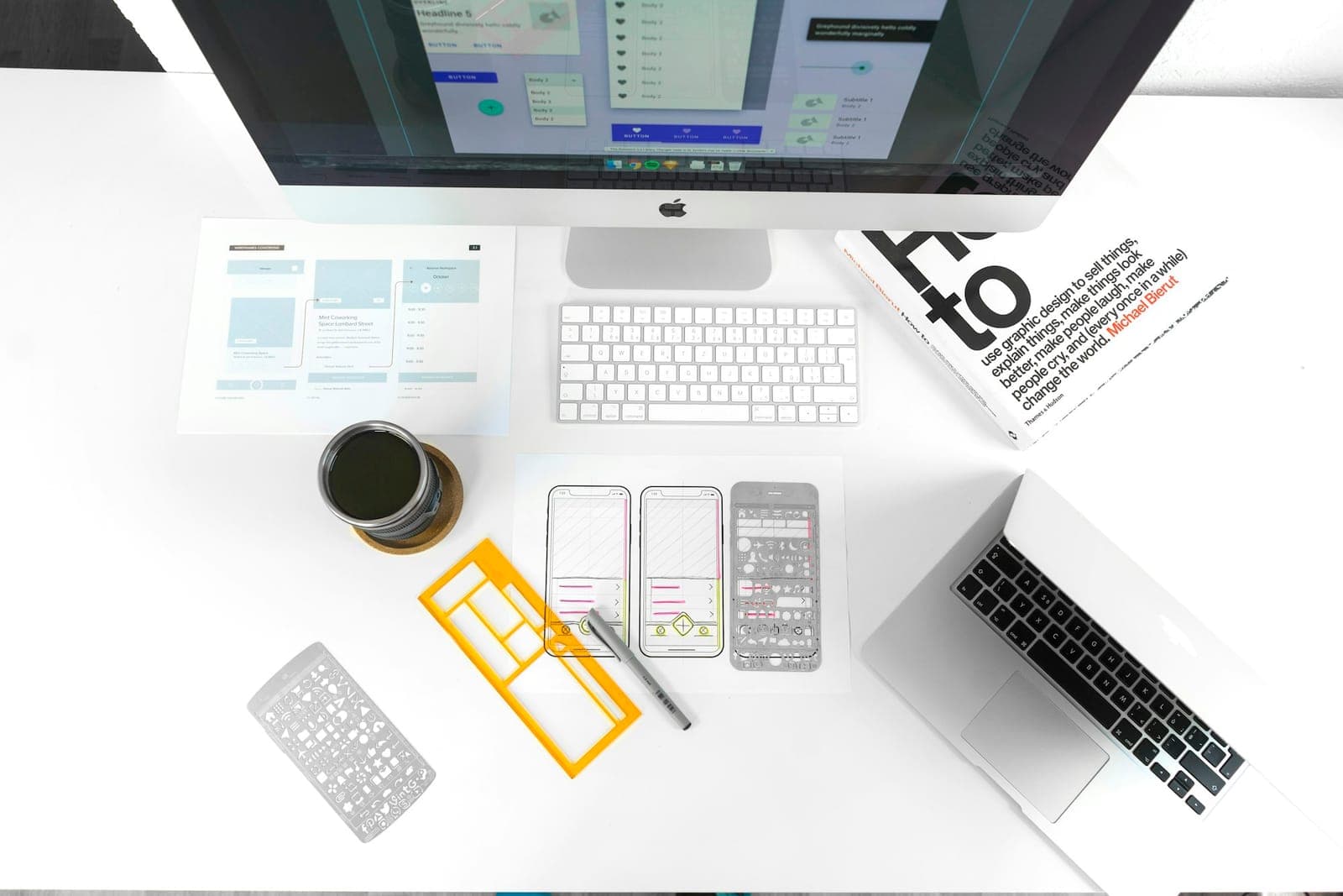
ResearchStructureInterfaceSystem
We design interfaces for business products and customer experiences so people can complete work without fighting the software. Not decoration — clarity for teams who live in the product every day.
We start with the people who will use the product and the job they need to finish. Decisions come from evidence, not assumptions — so the design solves the real problem, not the one that is easiest to draw.
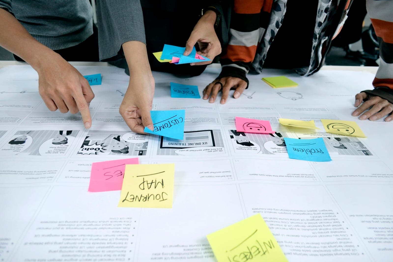
Journeys, pains, and moments mapped with the people who own the work.
Discovery sessionWhat we answer first
The roles and contexts the product has to serve
Uncover user needs, pain points, and behaviour patterns to guide confident product decisions.
The few flows that matter most
Map the work people need to finish, so screens are designed around those jobs rather than a feature list.
The friction worth designing away
Review the existing interface to find the confusing screens, dead ends, and repeated friction.
We map journeys, screens, and decisions first. Getting the structure right is what keeps a product usable as it grows — visual design is applied to a skeleton that already works.
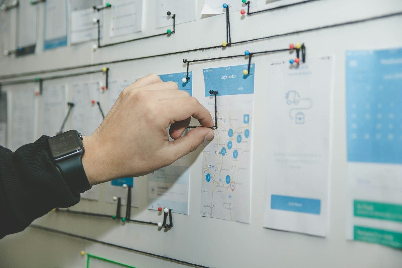
Screens become a path
Every screen earns its place in the journey before it is designed.
A flow, before a screen
Where the job starts
The one real choice
Complete the task
Proof it worked
Edge cases designed, not discovered late
Map end-to-end flows to remove bottlenecks and improve completion rates across channels.
Decide what lives where, so people can predict where to find things instead of hunting.
Low-fidelity screens that settle layout and priority before anyone argues about colour.
We create layouts, components, and states that teams can actually implement — designed for real content, real data, and the empty, loading, and error moments that decide whether a product feels finished.
Interface anatomy
Type scale
Clarity first
A hierarchy people can scan before they read.
Component states
Colour
Spacing
What the eye reads first, and what can wait.
Default, hover, focus, disabled, loading, empty, error.
A scale and palette that carry meaning, not decoration.
Feedback that explains what just happened.
Layouts, components, and states designed for real content and real data.
One system that holds together from a wide desktop to a phone in one hand.
Motion and feedback that explain the system instead of decorating it.
Contrast, focus order, and targets that work for keyboards and screen readers.
Immersive visuals and 3D assets that elevate interactions and brand perception when needed.
The brand expressed through the interface, not pasted on top of it.
Key journeys are reviewed as clickable prototypes before expensive build cycles. We test with real users, measure friction, and refine on evidence — so engineering starts from a design that has already survived contact with reality.
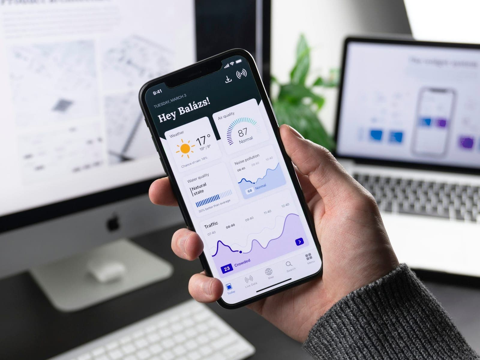
One tap, one linked screen
Every round
Each cycle ends with something stakeholders and users can try — not a static picture to imagine from.
Rapidly validate ideas with clickable prototypes before investing in development.
Test with real users, measure friction, and refine interfaces based on evidence, not assumptions.
Review key journeys with stakeholders early, so decisions happen before code is written.
Components and patterns engineering can reuse as the product grows, plus specs and assets developers can implement without guesswork — so the product stays consistent long after the first release.
Scalable UI libraries and standards that ensure consistency and speed across products.
Colour
Type scale
Spacing
Radius
Component library
After launch
Design continuity
Keep the product consistent as new features are added — so it stays usable as it grows.
Ideal for
Teams replacing a product interface people struggle with.
Startups shaping their first real product experience.
Organizations aligning design and engineering on a single system.
What you get
Fewer confusing screens and dead ends
A shared language between design and development, and a product that stays usable as it grows.
Share the users, the work they need to finish, and where it breaks today — we will map the path from research to a design engineering can ship.